UI Elements
Switch
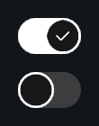
A toggle style control element
Overview
Switch extends Interactive and provides a clean on or off toggle with animated handle movement, pivot shifting, and visual state fades.
This component is ideal for settings menus, toggles, or any UI scenario that needs a modern switch control.

Customization
Visual States
Two groups define how the on or off look appears:
- Off CG: CanvasGroups active when switch is off
- On CG: CanvasGroups active when switch is on
Transition Effects
Interactive components support state based transitions through the Styler Object system. This includes color changes on hover, click, and other interactions. For more information, see the Styler page.
Interactive Effects
As a child of Interactive, Switch supports:
- Interaction states
- Ripple and trail effects
- Audio styling
- Highlight, pressed, and selected transitions
For more information, see the Interactive page.
Properties
Settings
| Name | Type | Description |
|---|---|---|
isOn | bool | Current on or off state |
invokeAtStart | bool | Invokes events on Start |
handleDuration | float | Animation duration for handle movement |
handleCurve | AnimationCurve | Curve used for the handle animation |
References
| Name | Type | Description |
|---|---|---|
switchHandle | RectTransform | Handle that slides left or right |
offCG | CanvasGroup[] | CanvasGroups used when switch is off |
onCG | CanvasGroup[] | CanvasGroups used when switch is on |
Visual Effects
| Name | Type | Description |
|---|---|---|
enableRipple | bool | Enables ripple feedback on pointer down or submit |
rippleParent | RectTransform | Parent used when spawning ripple instances |
ripplePreset | Ripple.Preset | Preset that defines ripple shape, color, size, and timing |
enableTrail | bool | Enables pointer trail while hovering the button |
trailParent | RectTransform | Parent used when spawning trail handlers |
trailPreset | PointerTrail.Preset | Preset that defines trail shape, color, scale, and fade settings |
Sound Effects
| Name | Type | Description |
|---|---|---|
sfxSource | StylingSource | Defines how audio clips are resolved (for example from Styler presets) |
stylerPreset | StylerPreset | Preset used by Styler to fetch audio and styling data |
highlightedSFX | AudioMapping | Audio mapping used when the button becomes highlighted or hovered |
pressedSFX | AudioMapping | Audio mapping used when the button is pressed or submitted |
selectedSFX | AudioMapping | Audio mapping used when entering the Selected state |
Events
| Name | Type | Description |
|---|---|---|
onValueChanged | UnityEvent<bool> | Fired when the value changes |
onSwitchOn | UnityEvent | Fired when turning on |
onSwitchOff | UnityEvent | Fired when turning off |
Public Methods
| Name | Parameters | Description |
|---|---|---|
SetValue(value) | bool | Sets on or off |
SetValue(value, sendCallback) | bool, bool | Sets value and optionally skips events |
Toggle() | None | Flips the switch |
SetState(state, instant) | InteractionState, bool | Sets Interactive visual state |
SetInteractable(value) | bool | Enables or disables interaction |
Code Example
using UnityEngine;
using Evo.UI;

public class SwitchExample : MonoBehaviour
{
    public Switch mySwitch;

    void Start()
    {
        // Initial state
        mySwitch.SetValue(true);

        // Listen to value changes
        mySwitch.onValueChanged.AddListener(val =>
        {
            Debug.Log("Switch value: " + val);
        });

        mySwitch.onSwitchOn.AddListener(() =>
        {
            Debug.Log("Switch turned ON");
        });

        mySwitch.onSwitchOff.AddListener(() =>
        {
            Debug.Log("Switch turned OFF");
        });

        // Toggle value
        mySwitch.Toggle();

        // Interactive features
        mySwitch.enableRipple = true;
        mySwitch.enableTrail = true;

        mySwitch.SetState(InteractionState.Normal);
        mySwitch.SetInteractable(true);
    }
}