UI Elements
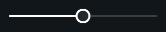
Slider
An extended slider with value formatting
Overview
Slider extends the built in Unity Slider and adds advanced value formatting, optional input field binding, animated handle scaling, and highlighted visuals.
Click here to see the native Unity UI Slider documentation.
Properties
Formatting
| Name | Type | Description |
|---|---|---|
displayMultiplier | float | Multiplies value before formatting |
displayFormat | DisplayFormat | Fixed or thousands number formatting |
textFormat | string | Output formatting with 0 placeholder |
Animation
| Name | Type | Description |
|---|---|---|
animationCurve | AnimationCurve | Curve used when scaling the handle |
TransitionDuration | float | Duration for scale and highlight transitions |
highlightedScale | float | Scale factor when hovered |
pressedScale | float | Scale factor when pressed |
Settings
| Name | Type | Description |
|---|---|---|
value | float | Sets the slider value |
minValue | float | Sets the minimum value that can be set |
maxValue | float | Sets the maximum value that can be set |
wholeNumbers | bool | Use whole numbers such as 0 and 1 without decimals |
invokeAtStart | bool | Invokes onValueChanged at Start |
References
| Name | Type | Description |
|---|---|---|
valueText | TMP_Text | Displays formatted slider value |
valueInput | TMP_InputField | Allows manual input for value |
highlightedCG | CanvasGroup | CanvasGroup used for highlight fade |
Events
| Name | Type | Description |
|---|---|---|
onValueChanged | UnityEvent | Fired when value changed |
OnStateChanged | Action<InteractionState> | Fired when the state changes |
Code Example
using UnityEngine;
using Evo.UI;

public class SliderExample : MonoBehaviour
{
    public Slider slider;

    void Start()
    {
        // Setup formatting
        slider.displayMultiplier = 1f;
        slider.displayFormat = Slider.DisplayFormat.Fixed1;
        slider.textFormat = "{0}%";

        // Handle value change
        slider.onValueChanged.AddListener(val =>
        {
            Debug.Log("Slider value: " + val);
        });

        // Manually update
        slider.value = 50f;
    }
}